A Good App Icon Scrubbing
Thu, Mar. 14 2013
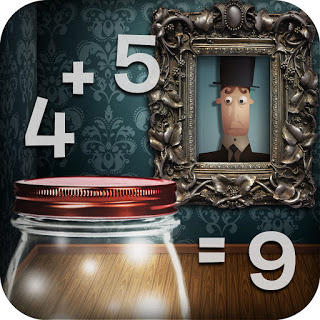 Original icon
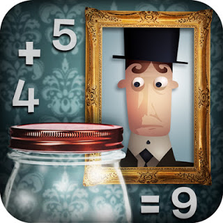 New icon after a good scrubbing
And you thought we were done talking about icons.
Check out the latest and greatest Mystery Math Town icon.
Sure, at first glance it looks like the original (new) icon but look closer...
It seems in our haste to settle the great icon design debate, we overlooked icon design rule #675 - overloaded detail and too many competing design elements are bad (especially when reduced to a quarter size of a postage stamp).
So we set our Aussie artist, Lis, on the task of cleaning the icon up to read better across all sizes.
Looking at them side by side now in the harsh light of day, even the large version of the original looks murky and yes, a little confused, beside the new and improved polished version.
Things are moving quickly now as we prep to submit the final app build to Apple next week, so stay tuned.
Next up, our app video teaser...