Deciding On The App Icon...
Wed, Apr. 30 2014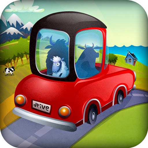
We really liked this icon but the sheep looks like a hostage.
We've reached a critical decision point in the app design process and we need your help.
It's a graphic designers ultimate challenge - how to sell your app in a single image that may be reduced to something that is smaller than a postage stamp, in a sea of miniature postage stamps.

When reduced, the sheep looks less scared but he also looks less like a sheep - too many details are lost.
We've got a lot to say about our new early learning app, Drive About: Number Neighborhood, but we can't say it all in the icon - that's what your app description and screenshots are for.
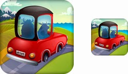
Option 1A has a rolling country feel
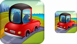
1B adds a city vibe in place of the mountains
Do we focus on the driving, and emphasize the quality of the app in a rich illustration (1A and B)?

Option 2A - sometimes less is more
Or, do we simplify and go with a strong profile and underline the math (2A and B)?
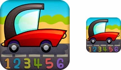
2B - color makes the numbers more playful - but harder to read at a smaller size
Which icon would entice you to find out more about the app?
We want to make a decision in the next couple of days so let us know what you think and we'll share the winner with you next week.